【Compose】Compose中的动画

本文介绍了Jetpack Compose中一系列动画API的使用
出现消失动画
AnimatedVisibility 是Jetpack Compose中一个非常有用的动画API,它可以让我们在Composable函数中实现元素的出现和消失动画。它的使用非常简单,只需要在需要添加动画效果的元素上使用AnimatedVisibility即可。
AnimatedVisibility 的方法签名如下:
@Composable
fun ColumnScope.AnimatedVisibility(
    visible: Boolean,
    modifier: Modifier = Modifier,
    enter: EnterTransition = fadeIn() + expandVertically(),
    exit: ExitTransition = fadeOut() + shrinkVertically(),
    label: String = "AnimatedVisibility",
    content: @Composable AnimatedVisibilityScope.() -> Unit
) {
    val transition = updateTransition(visible, label)
    AnimatedVisibilityImpl(transition, { it }, modifier, enter, exit, content = content)
}
visible是一个布尔值,用于控制元素的出现和消失。 modifier是一个Modifier对象,用于修改元素的外观。 enter是一个EnterTransition对象,用于控制元素出现时的动画效果。 exit是一个ExitTransition对象,用于控制元素消失时的动画效果。 label是一个字符串,用于标识元素。 content是一个Composable函数,用于定义元素的内容。
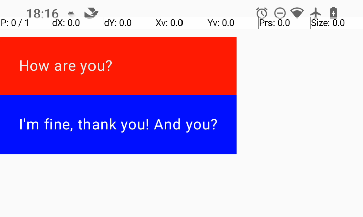
举例,设置两个text,上面那个text点击后开始退场,2s后重新出现。
源码如下:
@Composable
fun AnimatedVisibilityDemo() {
    Column(modifier = Modifier.width(IntrinsicSize.Max)) {

        val scope = rememberCoroutineScope()

        val isShow = remember { mutableStateOf(true) }

        AnimatedVisibility(visible = isShow.value) {
            Text(
                text = "How are you?",
                color = Color.White,
                modifier = Modifier
                    .fillMaxWidth(1f)
                    .background(Color.Red)
                    .clip(RoundedCornerShape(10))
                    .clickable {
                        isShow.value = false // 点击后消失
                        scope.launch {
                            delay(2000)
                            isShow.value = true // 2秒后重新出现
                        }
                    }
                    .padding(20.dp)
            )
        }

        Text(
            text = "I'm fine, thank you! And you?",
            color = Color.White,
            modifier = Modifier
                .fillMaxWidth(1f)
                .background(Color.Blue)
                .clip(RoundedCornerShape(10))
                .padding(20.dp)
        )
    }
}
可以看到 Compose 为了简化使用,已经预设了进出场的动画,进场是fadeIn() + expandVertically(),出场是fadeOut() + shrinkVertically()。如果需要自定义动画效果,可以手动声明并传入 AnimatedVisibility 的enter和exit参数。enter参数是一个EnterTransition对象,用于控制元素出现时的动画效果。
可以像官方例程里那样,自定义这两个参数传入:
AnimatedVisibility(visible = isShow.value,
            enter = slideInVertically {
                // Slide in from 40 dp from the top.
                with(density) { -40.dp.roundToPx() }
            } + expandVertically(
                // Expand from the top.
                expandFrom = Alignment.Top
            ) + fadeIn(
                // Fade in with the initial alpha of 0.3f.
                initialAlpha = 0.3f
            ),
            exit = slideOutVertically() + shrinkVertically() + fadeOut()) {

}
进场参数自定义,设定以top为基准,扩张的时候从上往下,滑动的时候从上往下。
更改动画时长
AnimatedVisibility 中的动画时长可以通过修改 enter 和 exit 中的动画参数来控制。例如,我们可以使用 fadeIn() 动画,并将持续时间设置为 2 秒:
AnimatedVisibility(
    visible = isShow.value,
    enter = fadeIn(
        animationSpec = tween(2000)
    ),
    exit = fadeOut(
        animationSpec = tween(2000)
    )
)
使用MutableTransitionState控制动画
AnimatedVisibility 还可以使用 MutableTransitionState 来控制动画。MutableTransitionState 是一个可变的 TransitionState,它可以在运行时更改其目标状态。通常可以用作在一开始就触发动画,还可以实时地 观察到动画状态 。
@Composable
fun AnimatedVisibilityDemo() {
    Column(modifier = Modifier.width(IntrinsicSize.Max)) {

        val scope = rememberCoroutineScope()

        val state = remember {
            MutableTransitionState(false).apply {
                // Start the animation immediately.
                targetState = true
            }
        }

        AnimatedVisibility(visibleState = state) {
            Text(
                text = "How are you?",
                color = Color.White,
                modifier = Modifier
                    .fillMaxWidth(1f)
                    .background(Color.Red)
                    .clip(RoundedCornerShape(10))
                    .clickable {
                        state.targetState = !state.targetState
                        scope.launch {
                            delay(2000)
                            state.targetState = !state.targetState
                        }
                    }
                    .padding(20.dp)
            )
        }

        Text(
            text = when {
                state.isIdle && state.currentState -> "Visible"
                !state.isIdle && state.currentState -> "Disappearing"
                state.isIdle && !state.currentState -> "Invisible"
                else -> "Appearing"
            },
            color = Color.White,
            modifier = Modifier
                .fillMaxWidth(1f)
                .background(Color.Blue)
                .clip(RoundedCornerShape(10))
                .padding(20.dp)
        )
    }
}
观察效果:

给子项添加动画
有时候我们需要给子项单独添加动画,以获得更灵活的效果。AnimatedVisibility 里面的子项可以使用 animateEnterExit 修饰符,来添加更精细的动画效果。
    AnimatedVisibility(
        visible = isShow.value,
        enter = EnterTransition.None,
        exit = ExitTransition.None
    ) {
        Text(
            text = "How are you?",
            color = Color.White,
            modifier = Modifier
                .fillMaxWidth(1f)
                .animateEnterExit(
                    // Slide in/out the inner box.
                    enter = slideInVertically(),
                    exit = slideOutVertically()
                )
                .background(Color.Red)
                .clip(RoundedCornerShape(10))
                .clickable {
                    isShow.value = false // 点击后消失
                    scope.launch {
                        delay(2000)
                        isShow.value = true // 2秒后重新出现
                    }
                }
                .padding(20.dp)
        )
    }
需要注意的是AnimatedVisibility和其子项设置的动画效果是叠加的,我们如果不想要外面父组合项自带的动画效果,可以显示的传入EnterTransition.Noneh和ExitTransition.None。
添加自定义动画
通过 AnimatedVisibility 的内容 lambda 内的 transition 属性访问底层 Transition 实例。添加到 Transition 实例的所有动画状态都将与 AnimatedVisibility 的进入和退出动画同时运行。AnimatedVisibility 会等到 Transition 中的所有动画都完成后再移除其内容。对于独立于 Transition(例如使用 animate*AsState)创建的退出动画,AnimatedVisibility 将无法解释这些动画,因此可能会在完成之前移除内容可组合项。
例如在原有进场动画的基础上,添加一个颜色的动画:
 AnimatedVisibility(
) {
     val background by transition.animateColor(label = "color") { state ->
        if (state == EnterExitState.Visible) Color.Blue else Color.Gray
    }
        Text(
            text = "How are you?",
            color = Color.White,
            modifier = Modifier
               .fillMaxWidth(1f)
               .background(background)
               .clip(RoundedCornerShape(10))
        )
    }
使用 Crossfade 在两个布局之间添加动画效果
Crossfade 可使用淡入淡出动画在两个布局之间添加动画效果。通过切换传递给 current 参数的值,可以使用淡入淡出动画来切换内容。
var currentPage by remember { mutableStateOf("A") }
Crossfade(targetState = currentPage, label = "cross fade") { screen ->
    when (screen) {
        "A" -> Text("Page A")
        "B" -> Text("Page B")
    }
}
使用 AnimatedContent 根据状态切换内容
AnimatedContent 可以观测状态,并在状态更改时添加动画效果。
基础使用:
Row {
    var count by remember { mutableIntStateOf(0) }
    Button(onClick = { count++ }) {
        Text("Add")
    }
    AnimatedContent(
        targetState = count,
        label = "animated content"
    ) { targetCount ->
        // Make sure to use `targetCount`, not `count`.
        Text(text = "Count: $targetCount")
    }
}
其方法签名中,可以传入一个 animationSpec 参数,用于控制动画效果。默认的效果还是渐入渐出。
    transitionSpec: AnimatedContentTransitionScope<S>.() -> ContentTransform = {
        (fadeIn(animationSpec = tween(220, delayMillis = 90)) +
            scaleIn(initialScale = 0.92f, animationSpec = tween(220, delayMillis = 90)))
            .togetherWith(fadeOut(animationSpec = tween(90)))
    },
自定义动画效果:
transitionSpec = {
    // Compare the incoming number with the previous number.
    if (targetState > initialState) {
        // If the target number is larger, it slides up and fades in
        // while the initial (smaller) number slides up and fades out.
        slideInVertically { height -> height } + fadeIn() togetherWith
                slideOutVertically { height -> -height } + fadeOut()
    } else {
        // If the target number is smaller, it slides down and fades in
        // while the initial number slides down and fades out.
        slideInVertically { height -> -height } + fadeIn() togetherWith
                slideOutVertically { height -> height } + fadeOut()
    }.using(
        // Disable clipping since the faded slide-in/out should
        // be displayed out of bounds.
        SizeTransform(clip = false)
    )
}
上面运行之后可以看到,当目标值大于初始值时,会有一个向上滑动加上渐出的动画效果。
尺寸改变动画
使用 animateContentSize 修饰符可以让Composable函数在大小发生变化时进行动画效果。注意需要添加在任何尺寸修饰符之前,以防止动画效果被错误地应用。
@Composable
fun AnimatedVisibilityDemo() {
    Column(modifier = Modifier.width(IntrinsicSize.Max)) {

        val scope = rememberCoroutineScope()

        var state by remember { mutableStateOf(false) }

        Text(
            text = "How are you?",
            color = Color.White,
            modifier = Modifier
                .animateContentSize()
                .fillMaxWidth(1f)
                .height(if (state) 160.dp else 80.dp)
                .background(Color.Red)
                .clip(RoundedCornerShape(10))
                .clickable {
                    state = true
                    scope.launch {
                        delay(2000)
                        state = false
                    }
                }
                .padding(20.dp)
        )

        Text(
            text = "I am fine.",
            color = Color.White,
            modifier = Modifier
                .fillMaxWidth(1f)
                .background(Color.Blue)
                .clip(RoundedCornerShape(10))
                .padding(20.dp)
        )
    }
}
列表项动画
为列表的每个项添加动画效果,使用 animateItem 修饰符。
@Composable
fun ListItemAnimateDemo() {
    val listState = remember { mutableStateListOf<ListItem>() }

    LaunchedEffect(Unit) {
        repeat(10) {
            listState.add(ListItem(it, "Item $it"))
            delay(1000)
        }
        delay(1000)
        listState.removeAt(5)
    }

    LazyColumn(modifier = Modifier.fillMaxSize()) {
        items(listState, key = { it.id }) { item ->
            Text(
                text = item.title,
                color = Color.White,
                modifier = Modifier
                    .fillMaxWidth(1f)
                    .animateItem()
                    .background(Color.Blue)
                    .clip(RoundedCornerShape(10))
            )
        }
    }
}

data class ListItem(
    val id: Int,
    val title: String,
)
基于Value的动画
animate*AsState系列函数
这个系列函数的用法类似ValueAnimator,通过定义两个端点目标值,当使用标志位触发两端的值切换时,会自动进行动画效果。
例如改变Box的高度
这里的效果和上面提到的 animateContentSize() 是一样的。
@Composable
fun ValueAnimation() {
    var enable by remember {
        mutableStateOf(false)
    }
    val heightValueAnim by animateIntAsState(if (enable) 400 else 200, label = "box height anim")
    Box(
        modifier = Modifier
            .width(200.dp)
            .height(heightValueAnim.dp)
            .clickable {
                enable = !enable
            }
            .background(Color.Red),
        contentAlignment = Alignment.Center
    ) {
        Text(text = "Hello")
    }
}
heightValueAnim 设定了400和200两个端点值,通过 enable 标志位来切换。
Box 可组合项被点击后,更改 enable ,就会自动触发动画效果。
注意,无需创建任何动画类的实例,也不必处理中断。在后台,系统会在调用点创建并记录一个动画对象(即 Animatable 实例),并将第一个目标值设为初始值。此后,只要您为此可组合项提供不同的目标值,系统就会自动向该值播放动画。如果已有动画在播放,系统将 从其当前值(和速度)开始向目标值 播放动画。在播放动画期间,这个可组合项会重组,并且每帧都会返回一个已更新的动画值。
再例如对背景颜色的值添加动画
触发之后,会按照色阶上的值平滑过渡。
@Composable
fun ValueAnimation() {
    var animateBackgroundColor by remember {
        mutableStateOf(false)
    }
    val animatedColor by animateColorAsState(
        if (animateBackgroundColor) Color.Green else Color.Blue,
        label = "color"
    )
    Box(
        modifier = Modifier
            .drawBehind {
                drawRect(animatedColor)
            }
            .fillMaxSize(1f)
            .clickable {
                animateBackgroundColor = !animateBackgroundColor
            },
        contentAlignment = Alignment.Center
    ) {
        Text(text = "Hello")
    }
}
更改偏移量来移动可组合项
更改offset偏移量不会影响其布局测量的参数,只会变更它的绘制流程。因此不算做真正的移动,不会对其父组件或者平级组件产生影响。
@Composable
fun ValueAnimation() {
    var moved by remember { mutableStateOf(false) }
    val pxToMove = with(LocalDensity.current) {
        100.dp.toPx().roundToInt()
    }
    val offset by animateIntOffsetAsState(
        targetValue = if (moved) {
            IntOffset(pxToMove, pxToMove)
        } else {
            IntOffset.Zero
        },
        label = "offset"
    )

    Box(
        modifier = Modifier
            .offset {
                offset
            }
            .background(Color.Blue)
            .size(100.dp)
            .clickable {
                moved = !moved
            }
    )
}
要实现真正的移动动画效果,则需要重写Modifier的layout方法,来改变其测量的流程。假如是在一个Column中,这个Box下面的子控件就会被其挤下去了。
@Composable
fun ValueAnimation() {
    var toggled by remember { mutableStateOf(false) }

    val offsetTarget = if (toggled) IntOffset(150, 150) else IntOffset.Zero

    val offset = animateIntOffsetAsState(targetValue = offsetTarget, label = "offset")

    Column(
        modifier = Modifier
            .padding(16.dp)
            .fillMaxSize()
            .clickable {
                toggled = !toggled
            }
    ) {
        Box(
            modifier = Modifier
                .layout { measurable, constraints ->
                    val offsetValue = if (isLookingAhead) offsetTarget else offset.value
                    val placeable = measurable.measure(constraints)
                    layout(placeable.width + offsetValue.x, placeable.height + offsetValue.y) {
                        placeable.placeRelative(offsetValue)
                    }
                }
                .size(100.dp)
                .background(Color.Green)
        )
        Box(
            modifier = Modifier
                .size(100.dp)
                .background(Color.Blue)
        )
    }
}
添加阴影动画
想要为可组合项添加阴影动画,需要使用graphicsLayer方法来修改其阴影的大小。
@Composable
fun ValueAnimation() {
    val mutableInteractionSource = remember {
        MutableInteractionSource()
    }
    val pressed = mutableInteractionSource.collectIsPressedAsState()
    val elevation = animateDpAsState(
        targetValue = if (pressed.value) {
            32.dp
        } else {
            8.dp
        },
        label = "elevation"
    )
    Box(
        modifier = Modifier
            .size(100.dp)
            .graphicsLayer {
                this.shadowElevation = elevation.value.toPx()
            }
            .clickable(interactionSource = mutableInteractionSource, indication = null) {
            }
            .background(Color.Green)
    )
}
这里用到了
MutableInteractionSource,这是一个可观察的交互源,它可以用于监听用户与可组合项的交互事件,例如点击、长按、拖拽等。它提供了一个collectIsPressedAsState()方法,用于收集用户是否正在与可组合项进行交互的状态。
使用Transition
Transition 可管理一个或多个动画作为其子项,并在多个状态之间同时运行这些动画。
@Composable
fun TransitionAnimation() {
    var boxState by remember { mutableStateOf(BoxState.Collapsed) }
    val transition = updateTransition(targetState = boxState, label = "box")

    val color by transition.animateColor(
        label = "color",
        targetValueByState = { state ->
            when (state) {
                BoxState.Collapsed -> Color.Red
                BoxState.Expanded -> Color.Green
            }
        }
    )

    val height by transition.animateDp(
        label = "height",
        targetValueByState = { state ->
            when (state) {
                BoxState.Collapsed -> 100.dp
                BoxState.Expanded -> 300.dp
            }
        }
    )

    Box(modifier = Modifier
        .fillMaxWidth(1f)
        .height(height)
        .background(color)
        .clickable {
            boxState = if (boxState == BoxState.Collapsed) {
                BoxState.Expanded
            } else {
                BoxState.Collapsed
            }
        })
}

enum class BoxState {
    Collapsed,
    Expanded
}
首先定义一个enum类,来表示可组合项的两种状态。然后使用 updateTransition 方法来创建一个Transition实例。
在Transition实例上调用 animateColor 和 animateDp 方法来创建两个动画。这两个动画会在 Collapsed 和 Expanded 状态之间切换。
通过点击触发状态变化,可以看到可组合项的颜色和高度会随着状态的变化而变化。